Vodafone's new 360 service is designed to make social networking a lot easier, and to kick off that campaign it's launched the Samsung H1, the flagship phone of Vodafone 360.
The phone is actually a decent model with some nice hardware on the spec sheet. Vodafone clearly wants to design 360 in its own image, and to that end it's developed its own operating system, based on Linux Mobile (the basis for Google's Android).
This means a phone with a new take on elements like contacts display and application interaction, as well as a strong leaning on cloud-based use too – but will it be too much for consumers to be bothered with?
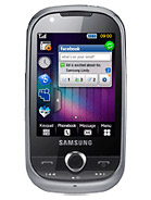
The Samsung H1, in its own right, is a decent model which would be competing at the sharp end of the Koreans' handset range.
The 3.5-inch OLED screen dominates the front of a phone that takes design cues from a lot of other devices in the Samsung range – if you've got an
i8910HD or
Tocco Ultra Edition, then you'll see how they're similar.
The phone is available in a variety of colours, but the brushed metal version looks pretty classy – the plastic back detracts from that impression when held in the hand, but overall it feels like a more premium phone.
Samsung has a tendency to go overboard with buttons on its phones, but whether it's had a change of heart or Vodafone has had a word in its ear, that's not the case with the H1.
The phone has a power button on the top (which also doubles as a screen lock key, something that has been missing from a number of other Samsung phones, like the
i7500 Galaxy) as well as a headphone jack.
The right-hand side has the search button (weirdly in metallic red – we're not sure of the significance there. We just assume Vodafone wants you to know that you can flick through the phone with ease on the H1).
Below it is the camera shutter button, which has a pleasant action to it like so many other Samsung phones. It manages that difficult balance of easy to press but also lets you push halfway to auto focus without accidentally taking a picture, which is impressive.
The bottom of the phone looks like nothing very interesting, but look closer and you'll see a thin layer of plastic that glows white when receiving a message – very cool.
On the left-hand side there's a microUSB port with a little slide down cover to protect it from dust and the like. Above that is the volume/zoom switch, which is once again easy to press.
The front of the phone is, as we mentioned, mostly about the screen. However, above it is a proximity sensor and that dying breed – a video calling lens.
The front buttons of the phone are also nothing like you've seen before – there's a phone, contacts and applications key, and nothing else. This means no menu or terminate key, with these moving to the touchscreen instead.
The battery cover is a simple plastic affair, holding nothing more than a Vodafone logo, the 5MP camera lens and single LED flash. It's jolly hard to remove as well, with some people probably needing a leverage tool to get it off.
Under the hood is a pretty standard affair – the battery needs to be taken off to slot the SIM card in, and the microSD card is hot swappable, living just below the SIM.
It's a well put together device, and you can see why Vodafone chose Samsung for the job – the H1 has taken a lot of cues from previous models and feels very nice in the hand.
In the box
And continuing with the Samsung theme, the H1 comes with the standard range of accessories in the large and chunky cardboard box.
There's the microUSB charger and lead, a hands-free 3.5mm headphone adaptor (as well as some decent Samsung buds) and a miniature user manual and quick overview of the 360 service.
There's no CD containing the PC software in there – this is because it's on the whopping 16GB internal hard drive of the phone. However, such a big amount of flash memory seems to mean that Vodafone doesn't deem a microSD card necessary, despite there being a slot for one.
If you're a mobile phone connoisseur (which we doubt anyone would admit to being) then you're in for quite a surprise with the Vodafone 360 Samsung H1. There's no home screen as such, with the three buttons at the bottom giving options to move to the calling and messaging, contacts or applications functions.
When you first turn the phone on, there's an option to sign up to Vodafone 360 – it's pretty imperative you do so, else you'll miss out on a lot of functionality from the H1 (and any future Vodafone models you'll have).
This is a simple sign-up process which you can either do online, or through the phone itself – we would recommend doing it on the PC (at
www.360.com) as that way you can add in social network and email accounts with greater ease.
From here you simply log into the likes of Facebook, Google or Windows Live (with the option of Twitter in the near future) and then see those contacts on the phone itself.
The touchscreen is pretty good on the H1, with the capacitive display responding very nicely to touch. It has the annoying Samsung 'springy' haptics inside, meaning that touching the phone, even when off, has a weird rattling feel to it.
However, these are a help in general use as they help to signify inputs, and if you're one of those dead against them then haptic feedback can be turned off.
Turning on the phone takes an oddly long time – not only does booting it up last for around 30 seconds, but then the Samsung H1 needs to parse through all the cloud-based information it needs, meaning that it will hang for a while before you can begin using it.
The lock system is also a little odd – as we mentioned before it's on the power button, but this is so small and recessed that it can be really hard to hit. It also doesn't work the first time you try and lock it either, meaning multiple hits.
However unlocking the phone is a breeze – like the
iPhone the H1 requires you to hit any key to awaken the phone from sleep mode, and then a simple swipe across the screen and you're away.
This is a welcome change from the convoluted 'smart unlock' screens found on the likes of
the LG Crystal or
Samsung Jet, and something we're willing all touchscreen phone manufacturers to offer.
It's almost impossible to know where to begin when trying to describe how the interface works – there are so many different options for each of the three 'home screens'.
For starters, we'll take the left-hand button: calling, messaging and history of the two (it's the best way we can think of to describe it.)
Here's where you'll get your first taste of the 3D UI, and it's really something rather cool. There was a demo video of how Firefox might look in the future which was released a while ago, and one of the notions is a 3D view of all the web pages you've looked at, allowing you to move backwards to observe them chronologically.
That's the same idea that's been used here – on pressing the calling button (that's the shortened name we're giving it) you can see all the messages and phone calls you've made and received.
And swiping the finger up will see the tiles of information cascading forwards as you traverse through time itself, allowing you to see who you called in order.
OK, we admit that a list might be a more efficient way of doing this, but we don't care about that – this is much, much cooler.
And if you don't want to see it all at once, you can filter it by email or text or phone call, making it easier to see the relevant information.
Of course, if you're desperate to see things in a list formation, that's easily achieved by pressing the calling button again – but that just seems to lack a sense of adventure.
The same principle is used on the contacts button as well, with the 3D view used to let you scroll through the people you want to communicate with (we'll get on to that in the next section).
And in a tip of the hat to the iPhone, the third section, Apps, is basically a list of tiles that can be scrolled through, with all the options available in one handy screen.
The cool thing about this is certain tiles have a small triangle in the corner, which means they can be expanded to show more information. This means updates from things like weather or football scores can be seen from the Apps screen without the need to open them up (which obviously takes a little time).
You can also re-order these little tiles by pressing the picture of the pen in the top right-hand corner – this is the universal symbol for editing things throughout the phone.
And don't worry if you don't know what an icon means on the H1 – you simply need to hold your finger over it, and a small pop up will tell you.
The navigation system through menus and applications has been re-tooled somewhat in Vodafone's new version of Linux Mobile, whereby you have to navigate forwards and backwards using icons at the top of the screen.
This means having to stab at little crosses or ticks with your thumb, which is a little hard to do. We've no idea why Samsung persists with this method, as it uses a similar system on other phones, but it very much handicaps one hand operation.
Vodafone has also cocked a snook to Android with the 360 OS, as pulling down a menu from the top of the screen (achieved by simply sliding you finger from the alerts bar at the top) will bring a list of running programs, which is handy when you get a message or a new chat – you don't have to exit the program you're in to check it out.
The interface from Vodafone with the Samsung H1 is interesting, and for the most part works – it clearly takes cues from other operating systems, most notably those from Samsung.
The phone, with its 600MHz processor, might not be the best suited to all the cloud data it needs to pull down to function properly, but it rarely falls apart and is certainly a decent effort.




.gif)


